Utilization Reports
A robust reporting tool for the building blocks of your company.
ROLE
Product Design Lead
CONTEXT
Web App Feature Design
TIME
January 2020 – June 2020
Backbone is the only product development platform built for the direct-to-consumer economy. Their suite of connected features emphasize speed, flexibility, and connectivity for modern product teams. The mission:
The future of consumer brands is digital. Backbone provides the platform that empowers fashion brands to innovate, design, and develop products at digital speed while scaling for growth.
As a part of the platform moving from 1.0 to 2.0, we needed to ensure that our users retained all the tools and features they had come to expect in version 1. One of the biggest missing pieces was Utilization Reports. The majority of Backbone's clients are apparel companies, and our users needed a way to display selected sets of components in dynamic, exportable reports to help with Purchase Orders and product planning.
Backbone Website
What is it?
Utilization Reports are an analytics tool leveraging powerful filtering on the entire company dataset to provide dynamic, flexible, real-time snapshots on the building blocks of each and every product: components. If you're in the tech world, you might think of components as independent, reusable chunks of code. In the apparel world, the idea is similar: components are the individual pieces of a garment that, put together, result in a finished product. For example, the shirt you're wearing right now might have buttons, one or two kinds of fabric, multiple stitching patterns, a tag, etc — these are all components.
Report Library
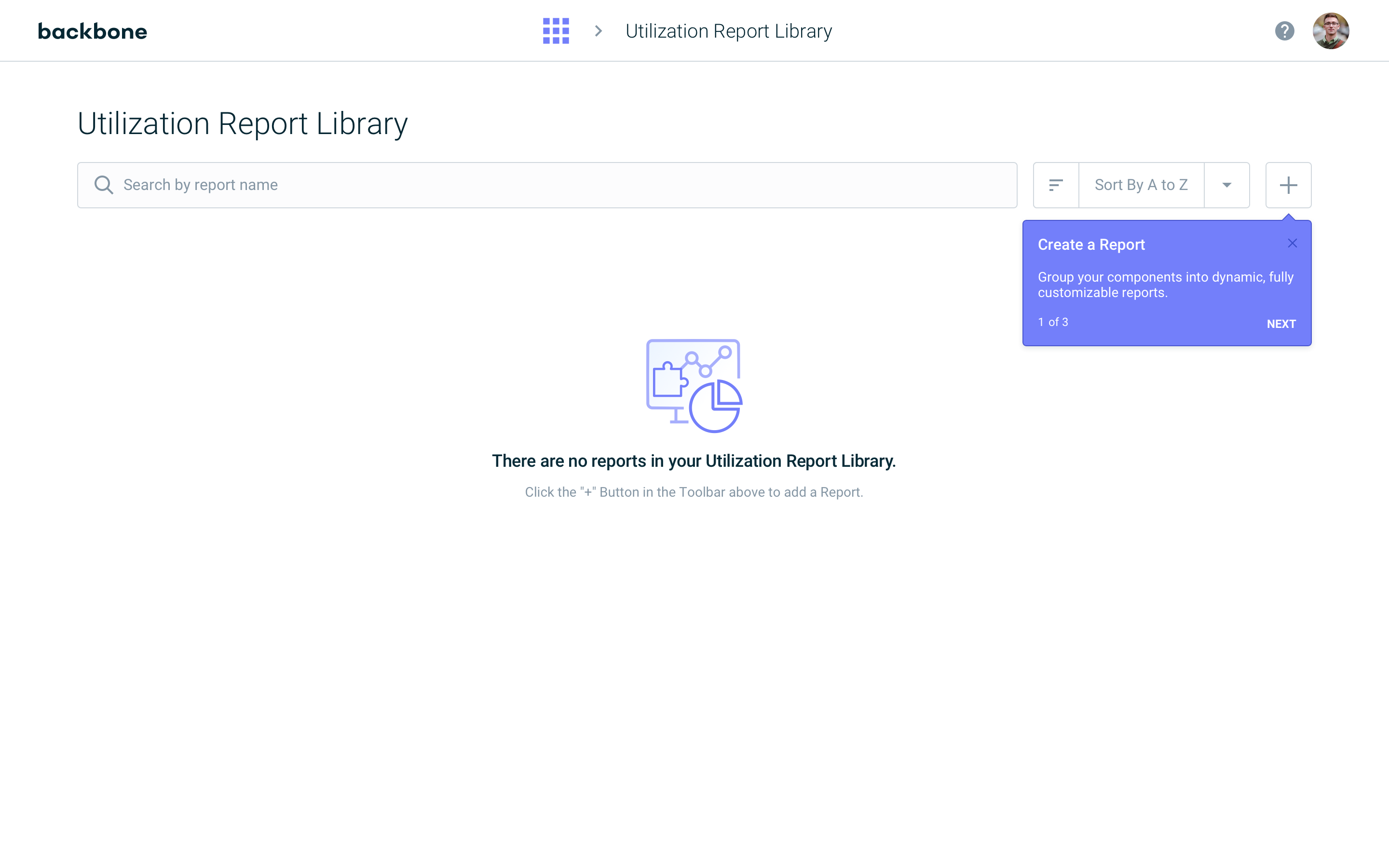
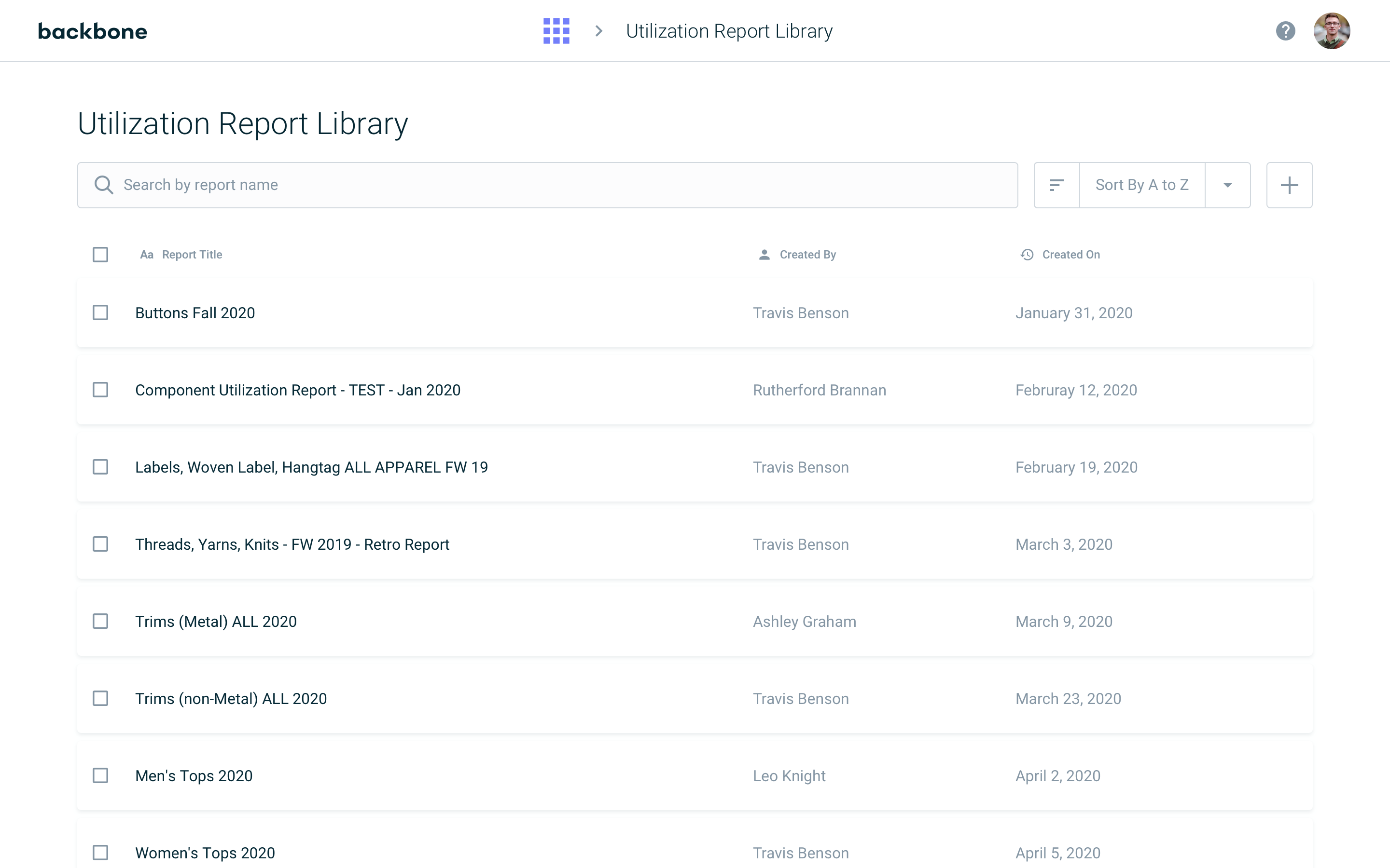
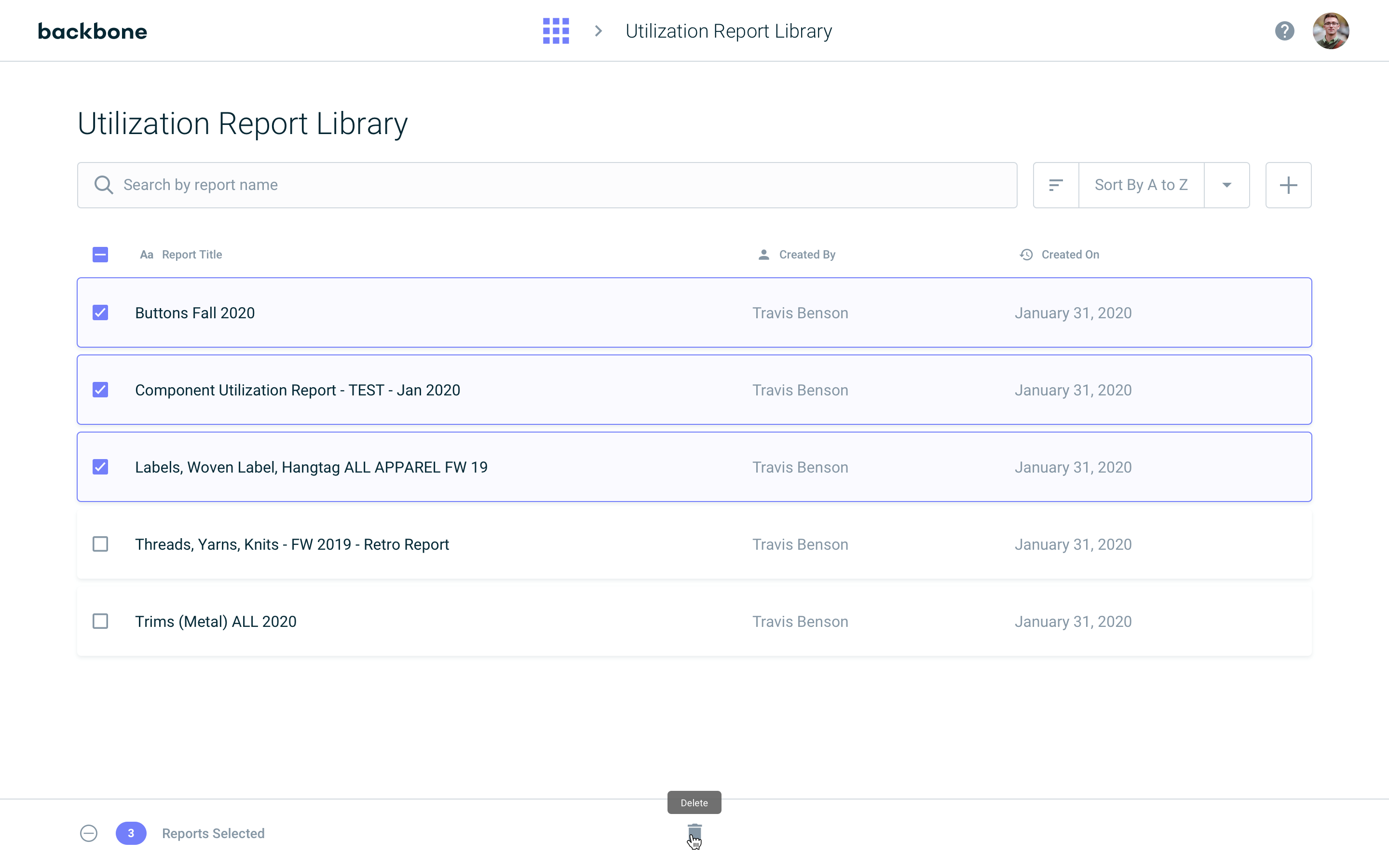
The report library serves as the landing page for this feature and houses all utilization reports created by or shared with the current user.
Report Creation

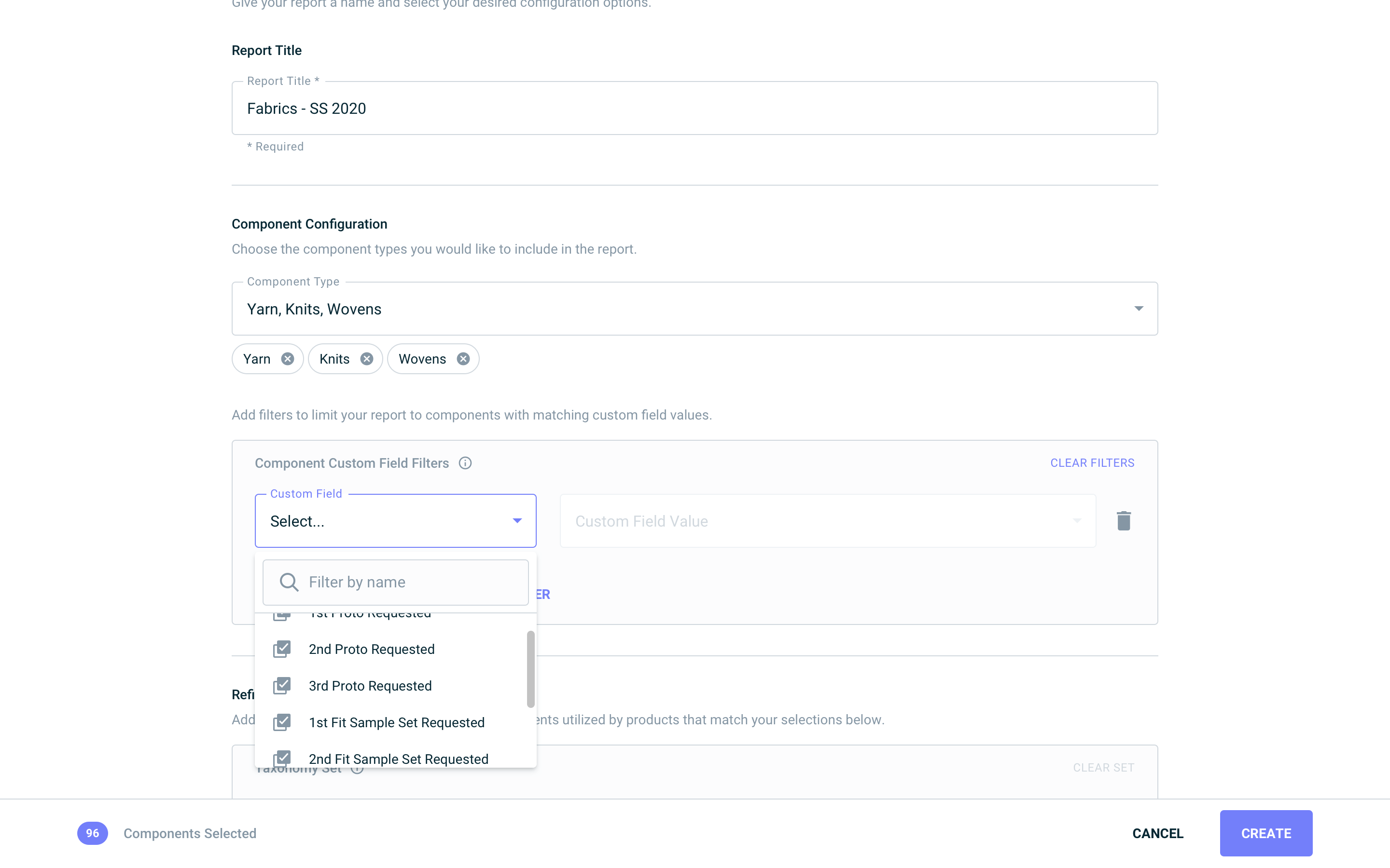
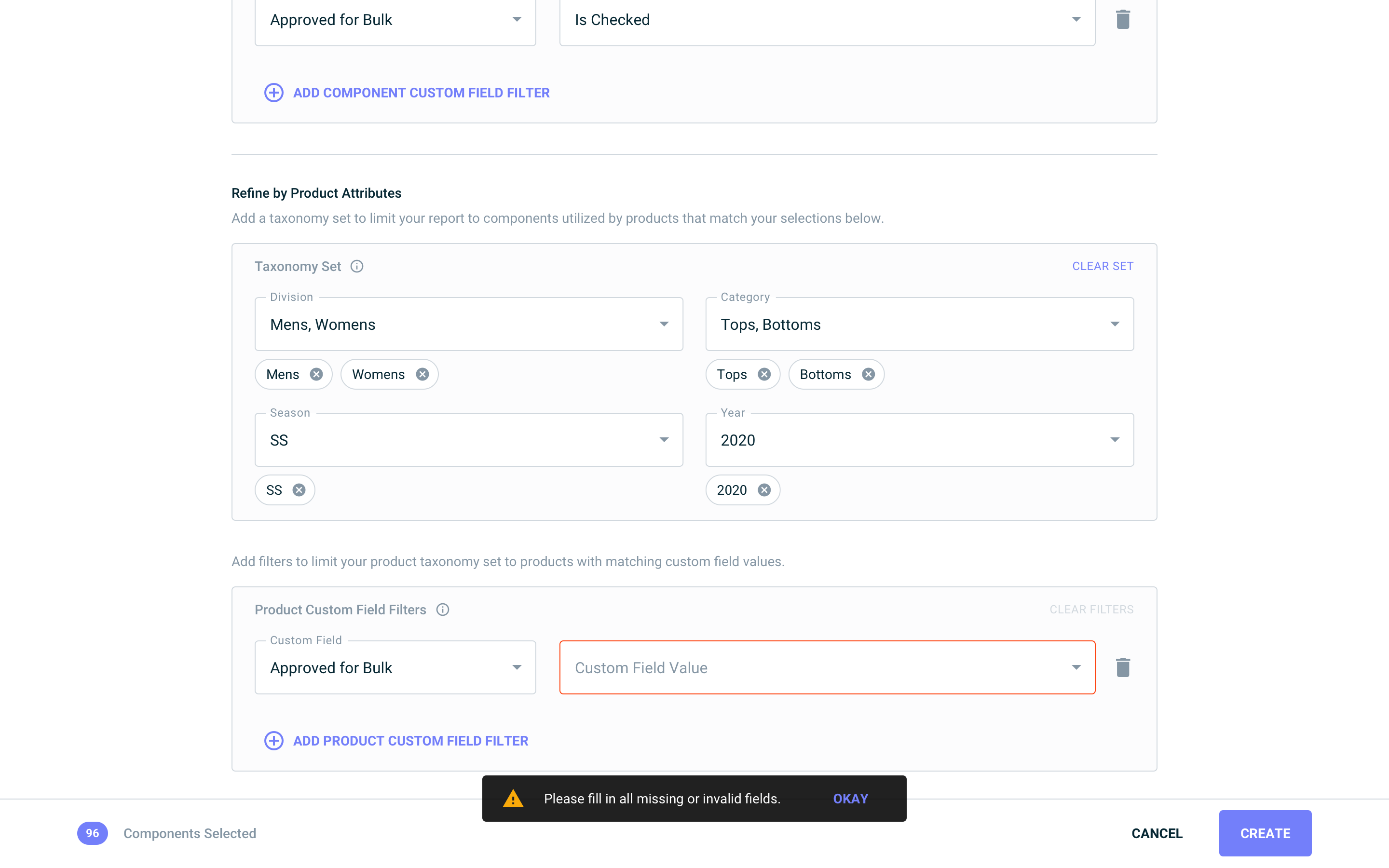
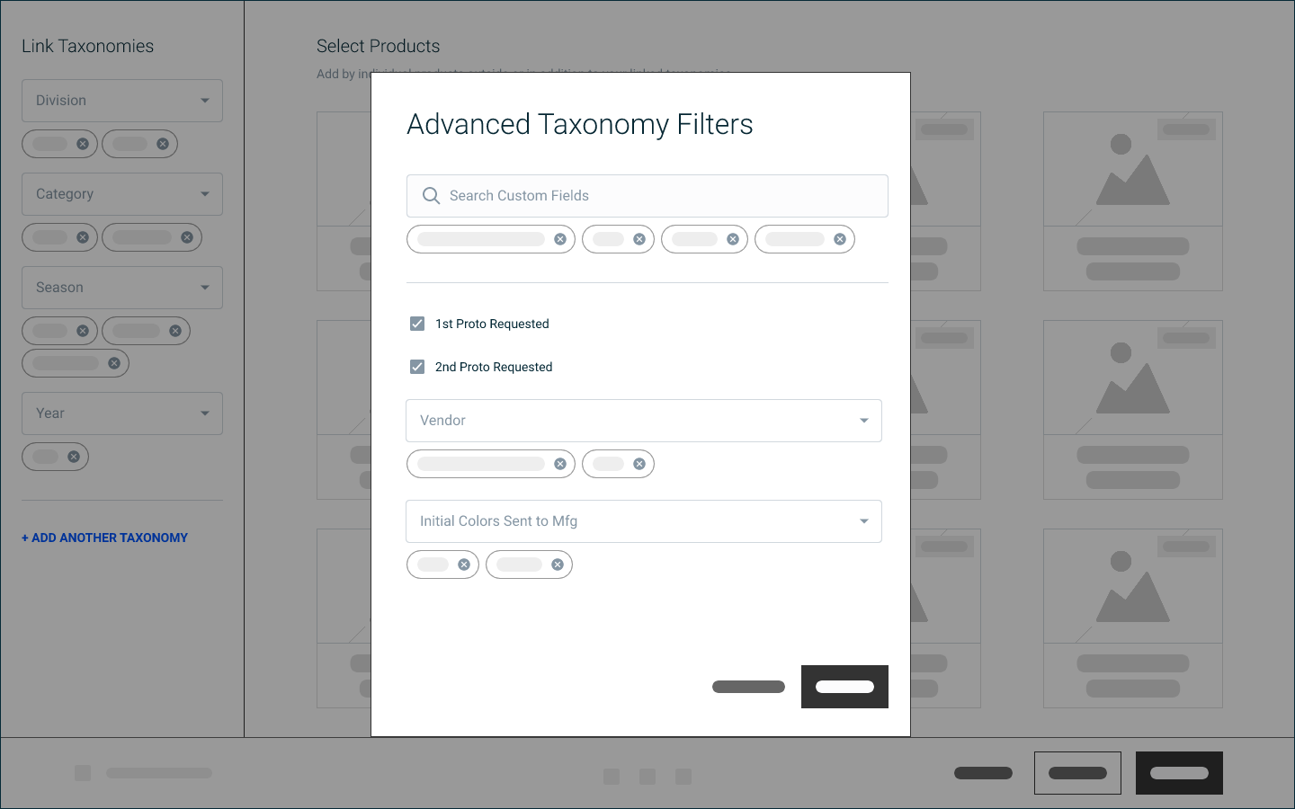
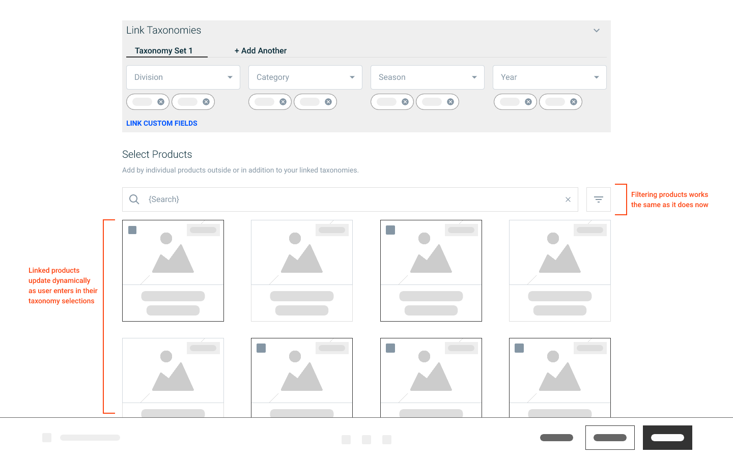
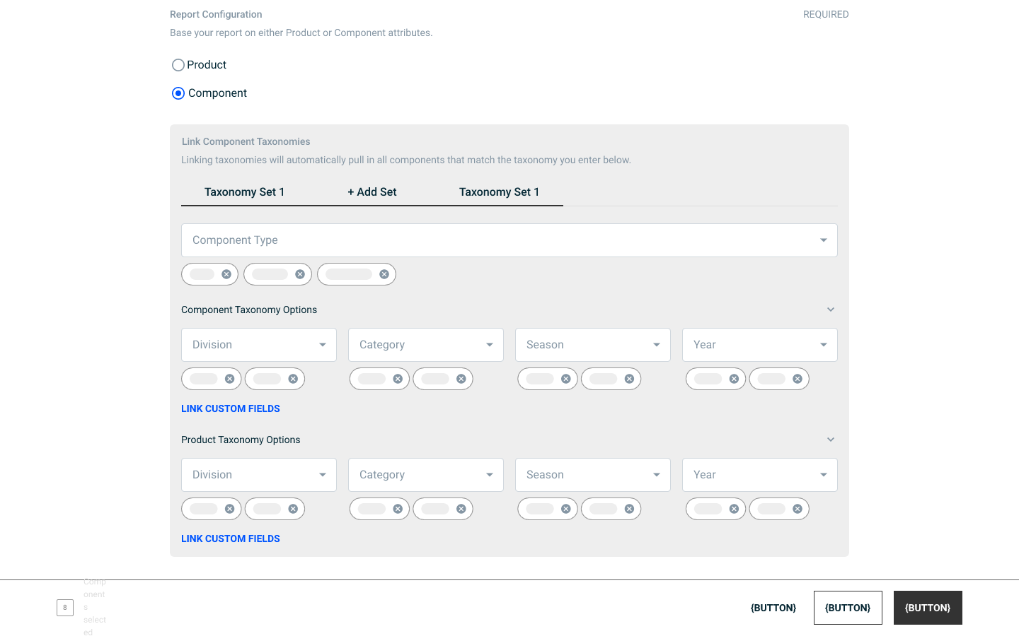
Here, the user decides which components to include in the report, using both component- and product-level attributes. I reimagined our established filtering UI/UX pattern in order to implement a simple, section-based filtering system with informative tooltips to let the user know how the report is generated in the backend.
Report Generation
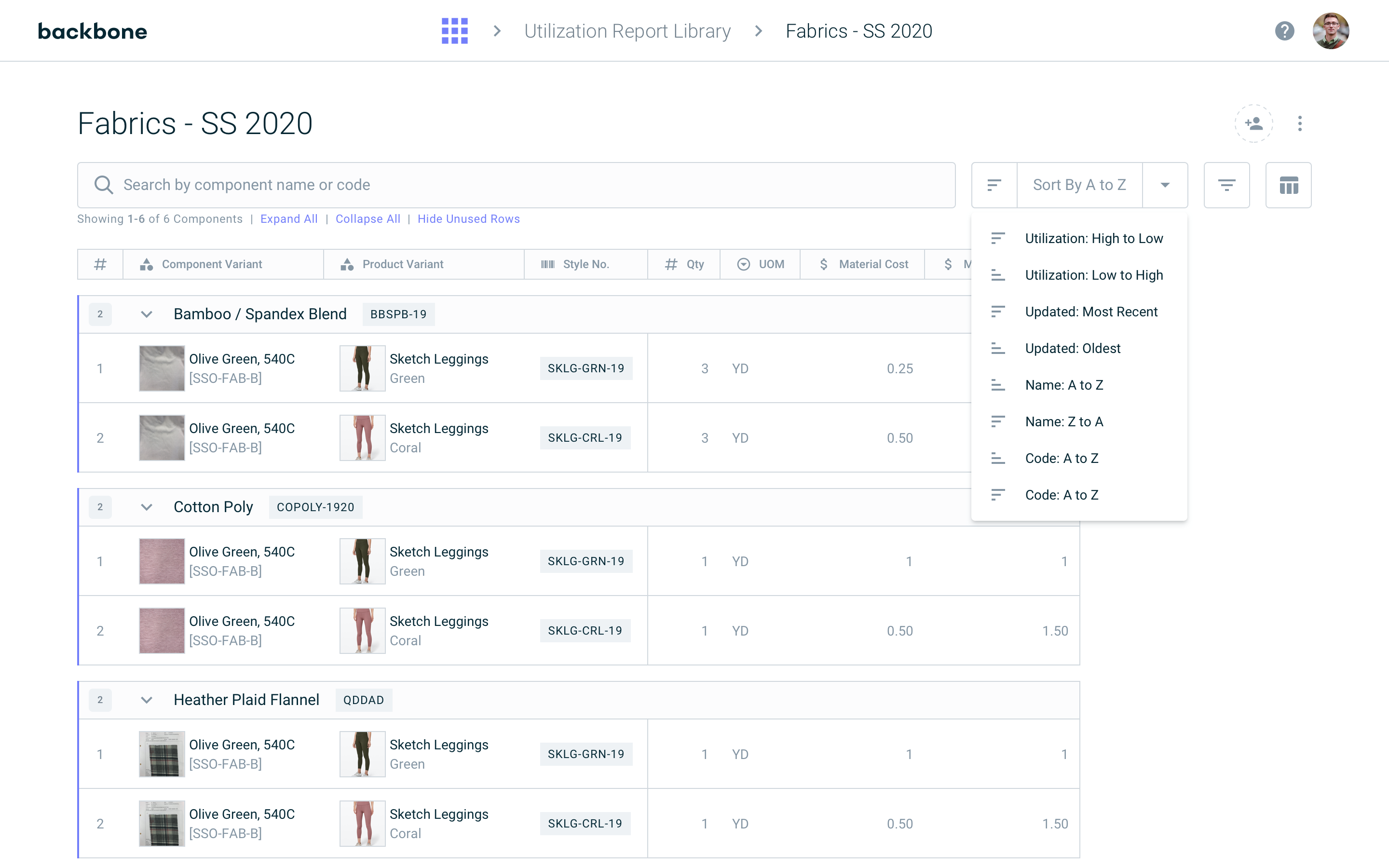

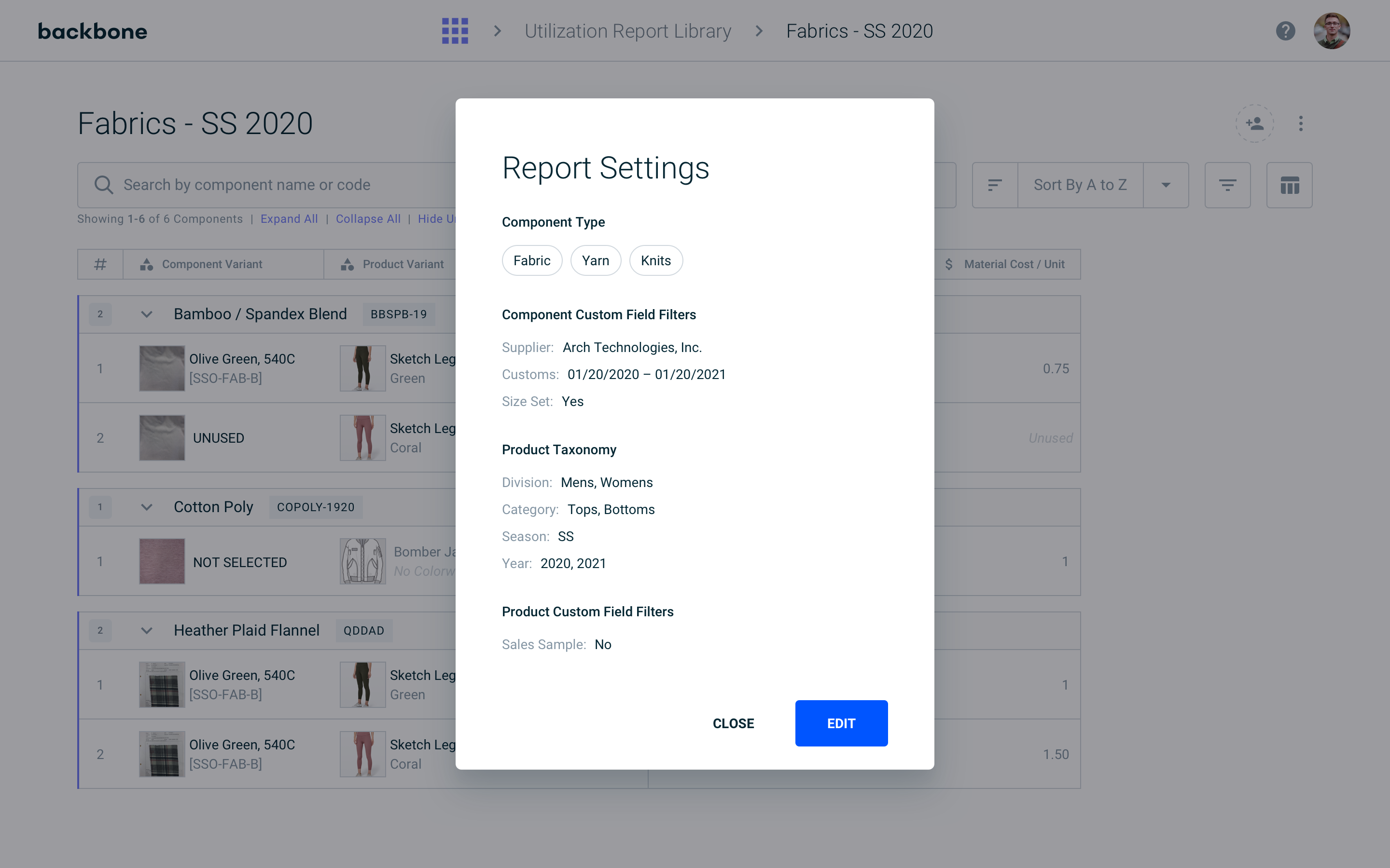
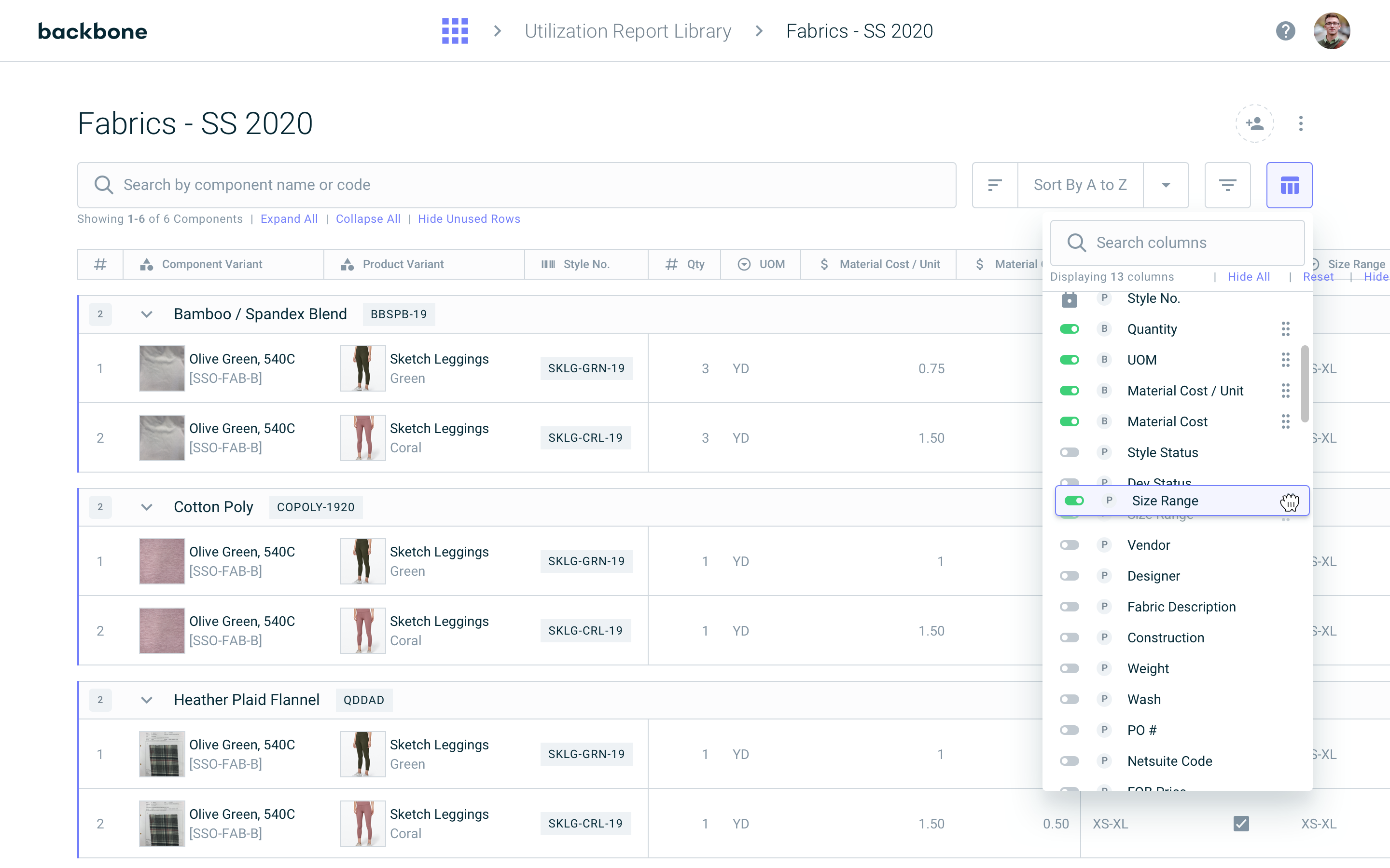
Reports are generated with a set of features to give the user ultimate control over the data displayed. These features include searching, sorting, filtering, and column management. While many of these patterns make use of reusable components found elsewhere in the app, I developed the column manager specifically for this reporting module.
UX Process
Luckily, we had an older requirements doc from 1.0 that helped to inform a lot of my initial direction. I also jumped into 1.0 to play around with the feature, noting interactions and jotting down my thoughts about the user experience. I worked with our wonderful CX lead to run a few Q&A sessions with our users to speak about their wants, needs, and biases.
Once I was confident in my knowledge of the problem, it was time to start drawing rectangles on screens! I used our bespoke Wireframe Kit (designed and developed by yours truly) to map out some initial explorations. A lot of the head-scratching came from determining how best to filter on the entire dataset.